The Power of Colour Psychology in Branding
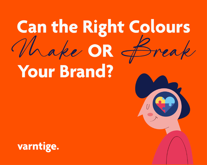
When you think about your favourite brands, what pops into your head? Is it their unforgettable logo, their catchy tagline—or maybe, just maybe—their colours? Yep, those seemingly simple hues are doing way more work than you might think. Colour psychology—the study of how colours sway our emotions, choices, and even behaviour—is like a secret weapon for brands. It’s how they tell stories, stir emotions, and build trust without saying a single word.
Think colours are just for making things “look pretty”? Nope, they’re the silent storytellers in every brand’s toolkit. At Varntige, we start every branding project with a deep dive into colour psychology. Our designer rolls up her sleeves and explores not just what looks good but what feels right. It’s about aligning colours with a brand’s vibe, industry, and message to create something that connects with people on a gut level.
So, let’s get into it! Here’s a behind-the-scenes peek at how colours work their magic in branding and why they’re way more than just eye candy.
Red: Passion, Excitement, and a Little Bit of Drama
Red is the showstopper. It’s all about bold emotions—passion, energy, urgency—you name it. That’s why it’s a go-to for industries that thrive on quick decisions, like fast food and retail. It’s also scientifically proven to make you hungry (thanks, brain!).
Think Coca-Cola, McDonald’s, or Target. They don’t just use red to catch your eye—they use it to spark excitement, drive action, and yes, make you crave fries. Next time you see those golden arches, you’ll understand why your stomach’s suddenly talking to you.
Blue: Trust, Calm, and a Dash of Dependability
Ah, blue. The crowd-pleaser. This color is all about trust, calm, and that feeling of “you’re in good hands.” No wonder industries like finance, healthcare, and tech are all over it. Blue screams reliability and professionalism.
Take a look at Facebook, LinkedIn, or PayPal. They’re practically wrapped in shades of blue to make you feel secure and confident. Whether you’re scrolling, connecting, or paying, blue’s got your back—and it makes you feel that stability.
Green: Nature, Health, and Growth
Green is the poster child for balance and harmony. It’s all about the good stuff—think nature, wellness, and fresh starts. For brands focusing on sustainability, health, or growth, green is a no-brainer.
Look at John Deere. Their earthy green shouts “we’re in tune with nature,” while also nodding to growth and vitality. It’s why eco-friendly startups and wellness brands gravitate toward this hue—it connects with people who care about their health, their planet, or both.
What’s Your Brand’s Colour Saying About You?
Colors aren’t just there to make things pop—they’re the emotional backbone of your brand. They help communicate your values, evoke feelings, and make you unforgettable (for better or worse). A thoughtfully chosen color palette can turn your brand into a trusted favorite—or leave it lost in the crowd.
At Varntige, we take color seriously—like, “nerd-out-on-color-psychology” seriously. Our designer doesn’t just pick what looks good; she picks what tells your story. It’s about creating a connection, not just a pretty logo.
Ready for a little self-reflection? If you’re wondering what message your brand’s colours are sending, you’re not alone. Whether you’re starting from scratch or looking to rebrand, thinking strategically about colour could be the game-changer your brand needs.
At Varntige, we live for creating brands that click with people. If you’re ready to dive into the world of colour and design, let’s chat. Together, we’ll craft something that doesn’t just stand out—but sticks around in people’s minds.


